Colour
Colour is how a picker is read at a glance. It is the difference between two hundred grey squares and something a person can navigate without thinking.
Select items and press C, or use the item's right-click menu.
What to colour by
Pick one meaning and hold to it. The usual choices, in rough order of how well they work:
-
Side — left / right / centre
The convention Maya itself uses: blue on the left, red on the right, yellow down the middle. Free to learn, because your animators already know it.
-
Control type — IK / FK / tweak
Good when a rig's switching is the thing people get lost in. Pairs well with shape: circles for FK, boxes for IK, in one colour each.
-
Body region — arm / leg / spine / face
Useful on very large pickers where the problem is finding a control rather than knowing what it does.
-
Depth — primary / secondary / detail
Strong colours for the controls used every shot, muted ones for the tweakers. Makes the common path obvious.
The one that does not work is colouring every control differently. A picker with forty colours has no colour scheme; it just has noise.
Matching the rig
If the rig's controls are already coloured — and most are — the cheapest good scheme is the one the rig already uses. The animator sees the same blue in the viewport and in the picker, and never has to translate.
Am_Picker knows Maya's 32 index colours for exactly this reason, so a control using override colour 6 can be matched precisely rather than by eye.
The colour picker
Opening it on a selection sets all of them. It offers:
- Maya's 32 index colours, for matching a rig directly
- A colour wheel with harmony modes, for building a scheme from scratch
- Custom palettes, saved and reused across pickers
Palettes persist, so a studio scheme can be set up once and reused on every character.
Mirroring colour
++alt+num-1++ and ++alt+num-3++ mirror colour only between two selected items — no shape, no position. Useful when the two sides of a character were built separately and you want them consistent without disturbing a layout you have already finished.
Outline, highlight and wires
Three appearance settings live in Preferences → Picker items rather than per item, because they should be consistent across a whole picker:
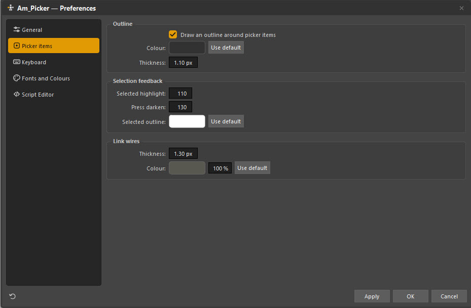
| Setting | What it controls |
|---|---|
| Outline | Whether items are drawn with a stroke, in what colour and thickness |
| Selected highlight | How much brighter a selected item goes |
| Press darken | How much it darkens while the mouse is down |
| Selected outline | The colour of a selected item's outline |
| Link wires | Thickness, colour and opacity of the wires drawn between linked items |
Turning the outline off gives a flat, graphic look that suits a picker built over artwork. Leaving it on helps when items are close together or share a colour.
Contrast is not optional
The picker is looked at beside a bright viewport, sometimes on a laptop screen, sometimes by someone who is colour-blind. Two practical rules:
Do not rely on hue alone. If left and right differ only in being red and green, roughly one man in twelve cannot use your picker. Vary position, shape or lightness as well — which you get for free, since left and right are already on opposite sides.
Keep the value range wide. Colours that are all the same lightness merge into a single field at a glance, whatever their hue.