Images and backgrounds
Every picture a tab owns, and what each one is for. This is what turns a grid of buttons into something that looks like the character.
Window → Image Manager
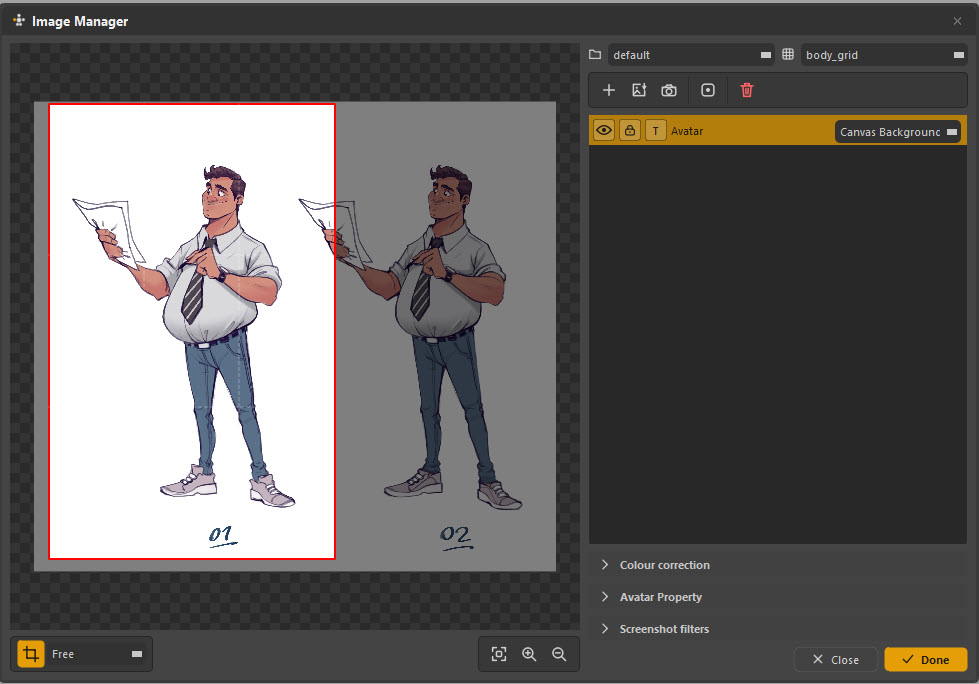
The three jobs an image can have
An image's usage decides what it is:
| Usage | Where it appears | Typical content |
|---|---|---|
| Canvas Background | Behind the picker items | A model sheet, a concept drawing, a viewport capture |
| Avatar | The portrait frame in the canvas's top-left corner | A headshot, so an animator knows which character this is |
| (unused) | Nowhere | Imported but not assigned yet |
One tab can hold several images with different jobs — a background and an avatar — and switching usage is a dropdown, not a re-import.
Getting images in
| Button | Does |
|---|---|
| + | Import a file from disk |
| Image | Import and place as a canvas background |
| Camera | Capture the Maya viewport |
| Item | Use an image as an item's fill |
| Bin | Remove |
Capturing the viewport
The camera button grabs the Maya viewport and brings it in as an image. This is the fastest way to get a picker that looks like the actual rig, without anybody drawing anything.
The Screenshot filters section decides what is in the grab:
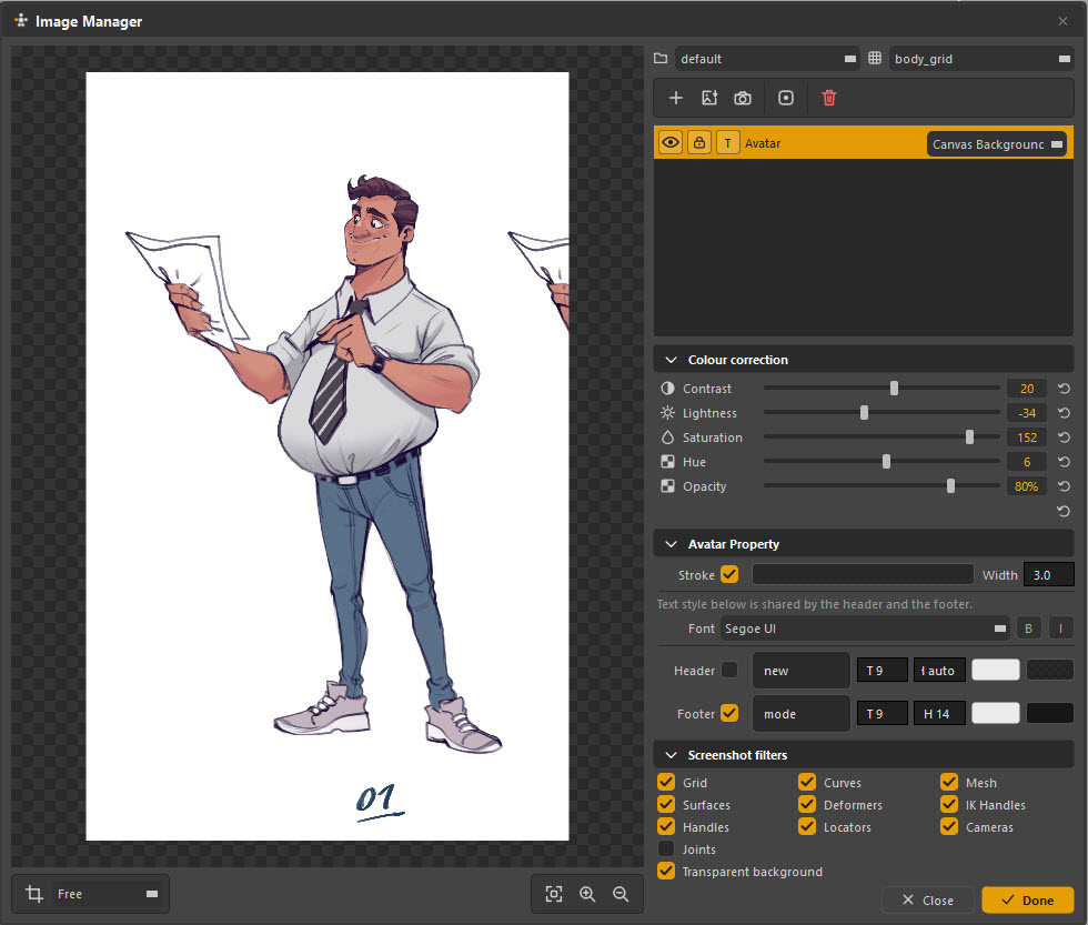
Grid, curves, mesh, surfaces, deformers, IK handles, handles, locators, cameras, joints — each is a toggle, plus Transparent background so the capture drops onto the canvas without a grey box around it.
Turn everything off except Mesh, frame the character, and you get a clean silhouette to build a picker over.
Adjusting an image
Crop
The crop tool is the toolbar button at bottom-left, with a ratio dropdown (Free, or a fixed aspect). Drag the handles, and the red frame is what you keep.
Colour correction
| Slider | Range |
|---|---|
| Contrast | Punch, for a washed-out reference |
| Lightness | Push a background down so buttons read on top of it |
| Saturation | Usually down — see below |
| Hue | Shift the whole image |
| Opacity | How strongly it shows through |
Fade the background hard
A background is reference, not content. Take saturation down and opacity to somewhere around 30–50% and the picker items sit clearly on top of it. A full-strength model sheet competes with the buttons and wins, and then nobody can find anything.
The screenshot above shows the opposite extreme deliberately — that is a source image being prepared, not a background in use.
Avatar Property
How the corner portrait frame is drawn, per picker:
| Setting | What it does |
|---|---|
| Stroke and Width | The frame's border |
| Font | Shared by the header and footer text |
| Header | Text above the portrait, with size and colour |
| Footer | Text below it — commonly the character name, as in Kamal |
A picker that does not set its own colours here falls back to the defaults in Preferences → General → Character avatar frame.
Placing a background
Once an image is a canvas background, the transform tool moves, scales and rotates it on the canvas like any other object. The grid / folder selectors at the top of the Image Manager say which grid and group the image belongs to, so a background can travel with the region it belongs to.
Backgrounds are per tab. A body tab and a face tab can have completely different art.
Packing images into a file
When you export an .ampkr, Pack images into the file copies
the images inside the package. The file then works on a machine that has never
seen your project — which is what you want when handing a picker to somebody
outside your pipeline.
Leave it off and the package references the images by path, which keeps the file small but means it only works where those paths resolve.
A workable order
- Capture or import the art first, before drawing a single item. Building buttons and then trying to fit a background under them is backwards.
- Crop it, fade it, and place it.
- Draw the picker over the top — or hand the image to Image to Picker and let it trace the shapes for you.
- Set an avatar last, so the tab is identifiable at a glance.